Oops! Something went wrong while submitting the form.
Indonesian Government Tax Invoicing
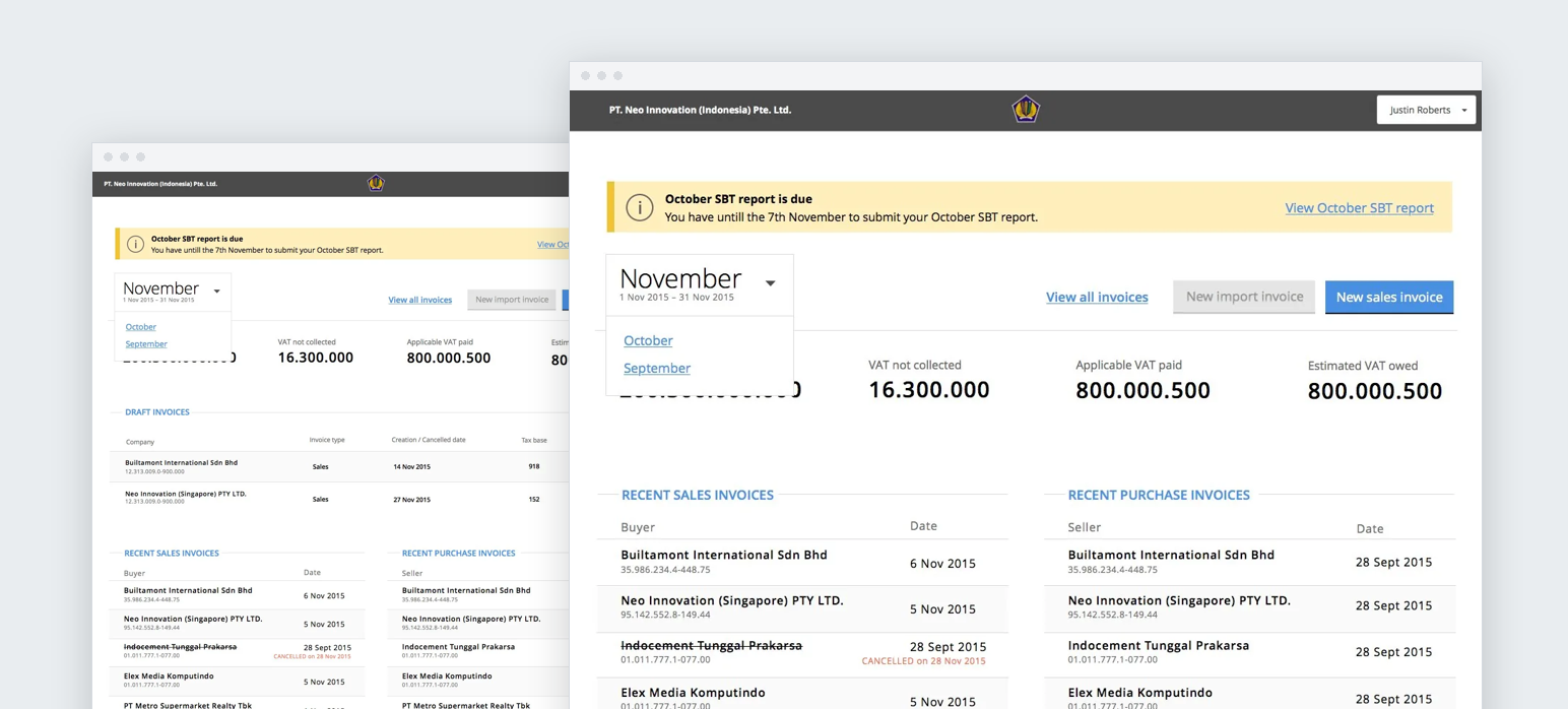
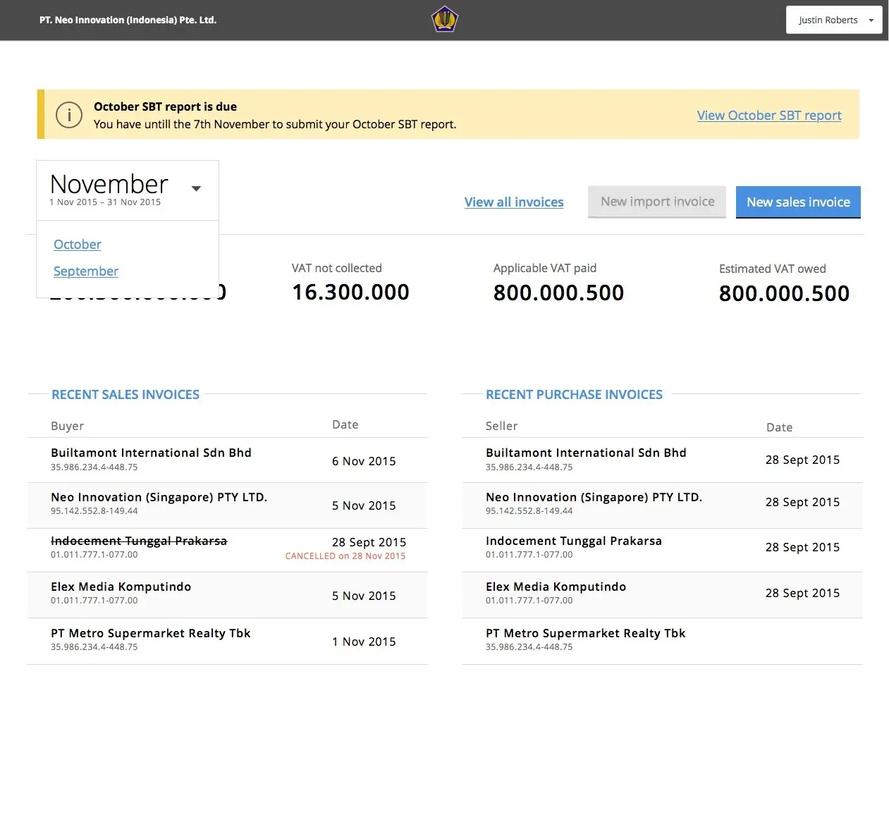
A monthly VAT invoicing and filing service for Indonesian businesses, built for the tax office through a third-party provider. I was principal designer from concept, and we built the design system in code alongside the product.
In their words
Principal product designer, Neo Innovation · Indonesian Government · 2015
The problem
Every VAT-registered business in Indonesia has to gather its sales and purchase invoices each month, work out the VAT it owes and file a report with the tax office. Getting it wrong or filing late means a fine, and in serious cases jail.
The tax office wanted one online service that businesses would be required to use for all of this. It was commissioned through a third-party provider, and Neo Innovation was brought in to design and build it with them.
The process it was replacing ran across two desktop tools. Invoices were made in one and the monthly report in the other, and the second could not read the QR code the first printed on every invoice. So input VAT was keyed in again by hand, and the finished report went to the tax office on paper, with a CSV file on a USB stick or CD.
Three constraints shaped everything else. It had to load fast and work on poor connections in regional Indonesia. It had to be fully accessible. And it had to work in Bahasa Indonesia.
What I did
I was principal designer and the main point of contact between the provider and the Neo team. That team was three engineers and me, working alongside the provider's own developers.
Ran problem interviews with tax practitioners, including the indirect tax team at a Big Four firm, to find where the current process broke: invoice numbers issued by the tax office running out, invoices that had to be backdated, and the double entry between the two tools.
Set out the research plan and the design principles we tested against: speed over interface detail, ask only for what is necessary, use confirmation and validation to build confidence, and show only what the task in hand needs.
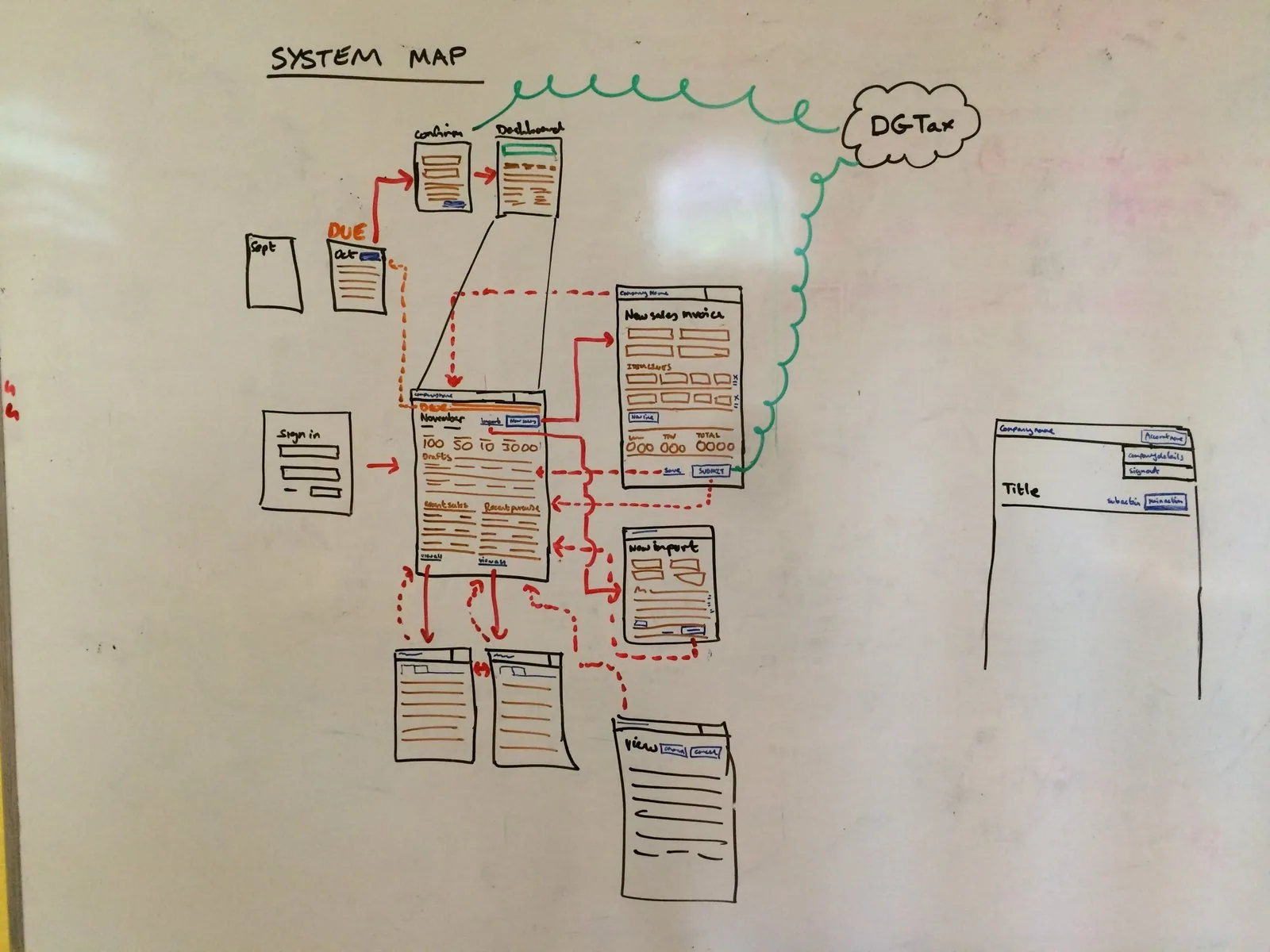
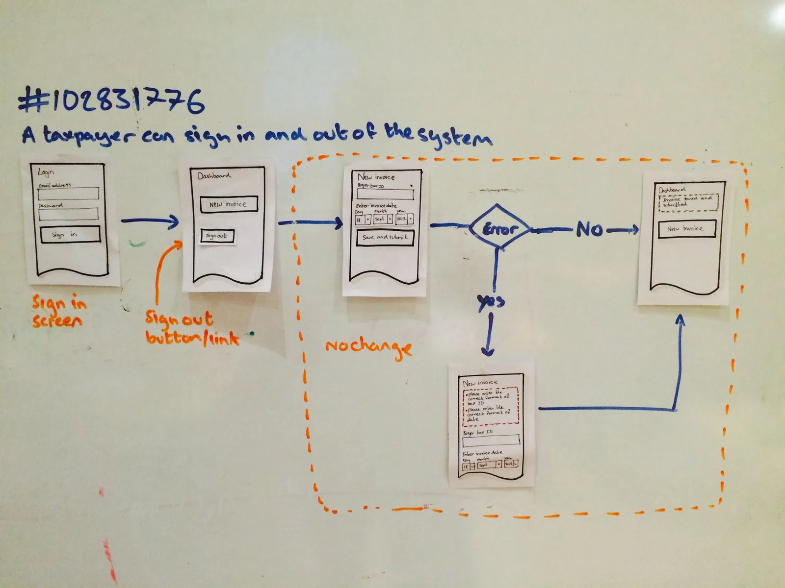
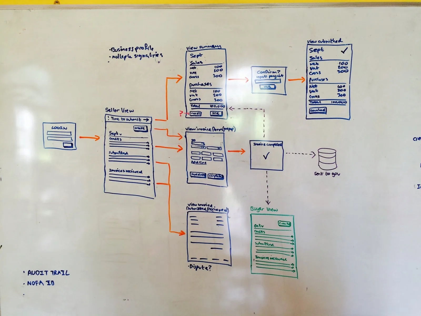
Mapped the system and the journeys from first sign-in through to the monthly report, then story-mapped the build into waves.
Tested paper prototypes of the core screens before anything was built.
Set the team up on style-guide-driven development. The living design system was built in code alongside the product, so every screen was assembled from the same components.
Held the front end to progressive enhancement. Every page worked as plain, fast HTML first, with JavaScript added only where it helped. Even the month selector had a version that needed no JavaScript.
What happened
The programme was stopped before it went further, as I understand it because the funding ended, and the code base was handed over to the provider.
What we handed over was the foundation: research that showed where the real friction was, a design system already running in code, and a front end built to work on a slow connection and in the local language. I don't know what the provider built on it after that, so I won't claim more.
By request
Want the full case study?
There's a longer version of this one, with the research, the decisions and the screens behind it. I share it with people I'm actively talking to. Tell me a little about why you'd like to see it and I'll come back to you about access.